There’s something magical about seeing a kid light up when they love what they’re wearing. You know that feeling—that burst of joy when something just feels like you. That’s what I believe good kidswear design should do: let children shine as their unique selves, while still telling a story that feels true to the brand behind it.
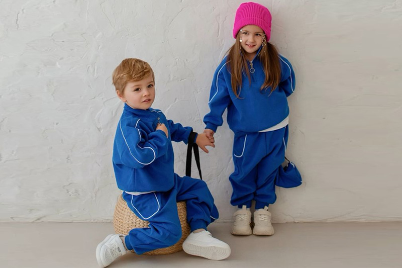
Children’s clothing design can celebrate individuality while keeping visual brand consistency. It’s about using playful, personality-driven styles—like bold prints or fun silhouettes—within a consistent brand color palette, themes, and tone. This balance builds emotional connection with parents, trust in the brand, and excitement in kids.
It’s not either-or. We can design with heart and harmony—letting every child feel seen while keeping our brand instantly recognizable.
How do we celebrate each child’s uniqueness through design?
You’ve probably noticed this too—kids don’t come in one mood, color, or personality. Some are wild explorers, others are gentle dreamers.
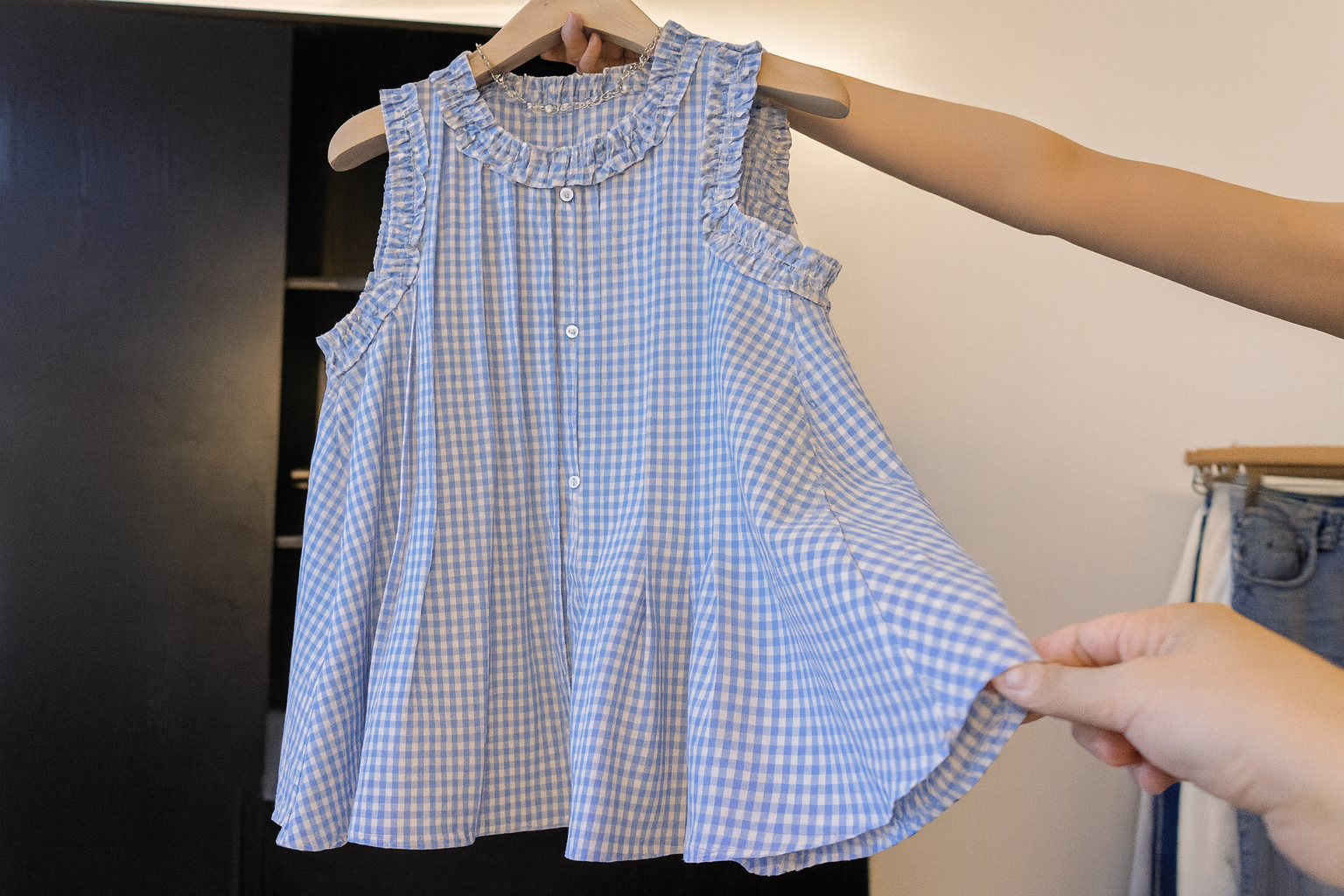
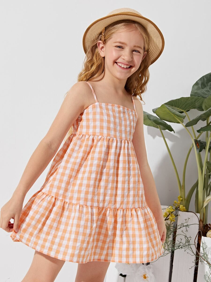
Designing for individuality means offering options that reflect a wide range of personalities, from soft pastels to fierce animal prints, all while maintaining comfort and practicality. Letting kids express themselves through what they wear is one of the most joyful things we can do.
Every time I hear a child say, “This is my favorite shirt,” I know we’ve done something right.
Can playful prints and colors still reflect a strong brand identity?
Yes—and they should.
A brand doesn’t have to be boring to be consistent. Using signature colors, motifs, or illustration styles helps even bold, playful pieces stay aligned with your visual identity. Whether it’s quirky giraffes or retro color blocks, you can be fun and recognizable at the same time.
Let me share a quick story: A buyer once told me they spotted one of our designs from across a tradeshow floor—just from the color palette. That’s the power of having a playful yet consistent visual voice.
Why does consistency across collections build brand recognition and trust?
In this busy, competitive space, being memorable isn’t optional—it’s survival.
When collections share a clear visual language—similar fonts, patterns, cuts, or color families—it signals reliability to customers. It tells buyers and parents: “We know who we are, and we’ll deliver that every season.” That consistency builds long-term trust and makes your brand easier to recognize—even without a logo.
I always say: It’s like seeing a friend across the playground. You just know it’s them.
Are we creating pieces that stand out—yet still feel unmistakably “us”?
Standing out doesn’t mean standing alone.
Designs should have that special “wow” factor that grabs attention, but still speak in your brand’s voice. Whether it’s an unusual neckline, signature hem, or your take on seasonal trends, make it yours. That’s how you stay fresh while staying familiar.
I once tested two hoodie designs: same shape, different pocket detail. The one with our signature rainbow stitching outsold the plain version 3 to 1. It wasn’t louder—it was more “us.”
Balancing Boldness and Brand Identity
| Design Element | How to Keep It On-Brand |
|---|---|
| New prints | Anchor them with brand colors or motifs |
| Trendy silhouettes | Pair with your signature trims or fabric base |
| Experimental palettes | Use them in accents rather than base layers |
| Seasonal themes | Frame them within your core aesthetic |
Is visual storytelling the secret to building an emotional connection with parents?
Yes, and here’s the thing—parents aren’t just buying clothes. They’re buying memories, values, and dreams.
Visual storytelling—through prints, lookbooks, collection themes, and even tags—helps parents emotionally connect with your brand. Whether it’s a forest adventure collection or cozy-at-home pieces, these stories make your clothes more than just “things.” They become part of childhood.
One mom told me, “I saved that bear-print jacket. My son wore it on his first day of school.” That’s storytelling doing its job.
Crafting Emotional Connection with Visual Elements
Let’s break down what visual storytelling can look like:
| Element | Emotional Effect |
|---|---|
| Seasonal collection themes | Feels curated and meaningful |
| Illustrated labels | Adds charm and personality |
| Lifestyle photoshoots | Helps parents see their child in your story |
| Packaging design | Makes receiving the clothes feel like a gift |
A brand is more than just a logo. It’s a feeling. A little memory tucked into the fabric.
Conclusion
Designing for kids means balancing fun and function—but also individuality and brand unity. When every piece speaks to them and to you, that’s when magic happens.
At Taian Lianchuang Textile Co., Ltd, we believe in playful pieces with purpose, made for real kids with real personalities—and a visual story that parents trust.