You know that feeling when you stumble across a kidswear brand and think, “Wow, this actually feels like art”? That’s exactly what happened the first time I saw a Rylee + Cru collection. It wasn’t loud or flashy—it was soft, soulful, and… different. Let’s talk about why this brand quietly became a favorite for so many families—and what we can take from their playbook.
Rylee + Cru stands out for its soft, earthy tones, whimsical hand-drawn prints, and minimalistic charm. They don’t just sell clothes—they create a feeling. Parents love them for their blend of comfort, simplicity, and visual storytelling. Their success shows that you don’t need to shout to be heard in the kidswear world—you just need a clear point of view and the courage to stay true to it.
There’s something quietly powerful about their aesthetic—and a lot we can learn from it.
What makes Rylee + Cru stand out in the modern kidswear market?
It’s a crowded space out there. Bright colors, busy patterns, over-the-top branding. But Rylee + Cru? They went the other direction—and parents noticed.
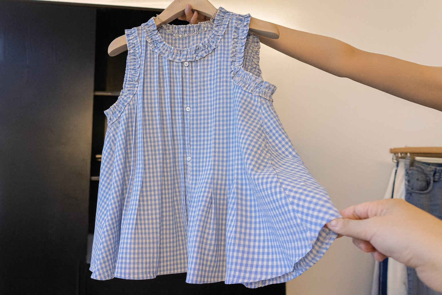
Rylee + Cru carved out a niche by being calm in the chaos. Their neutral palettes, hand-illustrated prints, and laid-back silhouettes offer something rare: serenity. In a market full of noise, their visual softness stands out, especially for design-forward parents who want something a little more… meaningful.
It’s not just about clothing—it’s a vibe.
Dive deeper: Creating quiet impact in a loud market
When I look at brands like Rylee + Cru, I’m reminded that sometimes less really is more. They didn’t build their brand on being the loudest—they built it by being the most intentional.
Let’s break down what they’ve done right:
1. Visual Consistency
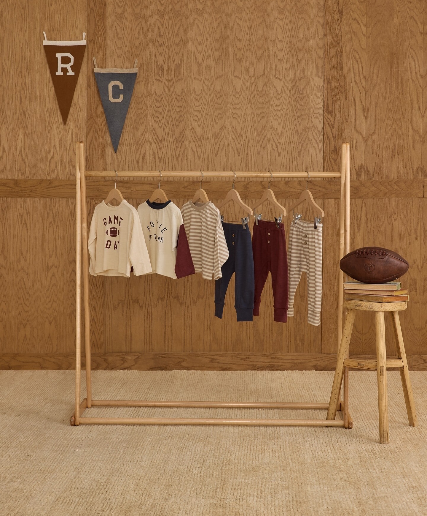
Their color palette is unmistakable: warm beige, muted sage, terracotta, dusty rose. You see it and instantly know it’s Rylee + Cru. This level of visual harmony creates what I call “scroll-stopping softness”—where every piece feels like it belongs in a lifestyle editorial.
2. Artist-Driven Prints
Unlike mass-market prints that scream “kid-themed,” Rylee + Cru’s patterns are hand-illustrated, often resembling art you’d hang on a wall. Rainbows. Wildflowers. Swans. They make you feel something—and that emotional pull creates loyal customers.
3. Simplicity Without Boring
Minimal doesn’t mean plain. Their silhouettes are relaxed but never shapeless. They mix comfort with just enough structure to make each outfit feel special—even if it’s just for a day at the park.
Here’s a quick look:
| Element | Rylee + Cru Approach |
|---|---|
| Color palette | Earthy, muted, consistent |
| Print style | Hand-drawn, subtle, imaginative |
| Fabric choice | Soft cotton, gauze, eco-blends |
| Design philosophy | Artistic, nostalgic, yet modern |
This quiet, thoughtful approach appeals not only to parents—but to buyers and retailers looking for brands that stand out on the rack without screaming.
How do their earthy tones and artistic prints create a signature look?
Rylee + Cru doesn’t follow trends—they create a world. And that world has a mood: soft, slow, sun-washed.
By sticking to earthy hues and nature-inspired hand-drawn prints, Rylee + Cru has created a visual language that feels both modern and nostalgic. Their collections aren’t seasonal noise—they’re timeless stories that unfold gently. This signature look builds instant brand recognition, even across global markets.
It’s not just what they use—it’s how they use it.
Why do parents love their blend of comfort, style, and simplicity?
It’s one thing for a piece of clothing to look good. It’s another for it to feel good on your child—and be easy for the parent too.
Parents love Rylee + Cru because their pieces are soft, easy to put on, and stylish without being overdone. They strike the balance between comfort and aesthetic—a rare sweet spot. The simple cuts and breathable fabrics mean kids are happy, and the cohesive designs make dressing up almost effortless.
Function meets feeling. That’s the secret sauce.
Can their storytelling approach inspire stronger brand identity?
Let’s be honest—brands are more than products. They’re stories people want to be part of.
Rylee + Cru uses storytelling in their collections, campaigns, and even product names. Every piece feels like it belongs to a chapter. This narrative-driven approach builds emotional connection and turns customers into fans. It also helps their photography and branding feel more like a lifestyle magazine than a catalog—drawing in parents who value meaning and memory.
People don’t buy clothes. They buy what it feels like to wear them.
What can we learn from their success with limited drops and curated collections?
If you’ve ever tried to buy from Rylee + Cru on launch day, you know: things sell out fast. And that’s not by accident.
They create anticipation by keeping collections limited and drops curated. This strategy builds urgency and excitement, and avoids the trap of overproduction. By focusing on smaller, more thoughtful releases, they maintain exclusivity—while staying sustainable and nimble. For B2B buyers, it also means lower risk and higher sell-through rates.
Scarcity, when done right, creates value.
Conclusion
Rylee + Cru didn’t follow the usual kidswear playbook—and that’s why they stand out. Their soft aesthetic, thoughtful drops, and storytelling approach remind us that success doesn’t always mean being loud. Sometimes, it means being true.